Moss Gallery
Project
The Product
Moss Gallery is an art gallery that features local and international artists and their selected body of work. Typical users are 20 - 65 years old, and most are art enthusiasts or work in a creative profession. This website aims to inspire its visitors and serve as an educational platform to connect users to artists.
My Role:
Lead UX designer and Lead UX Researcher for the Moss Gallery website.
Responsibilities:
User research, conducting interviews, paper, and digital wireframing, creating low and high-fidelity prototypes, conducting usability studies, accounting for accessibility, and iterating on the remodel of designs.
The problem
Available gallery websites are difficult to browse though and do not always include enough information.
Research
For my user research I conducted interviews to better help me understand potential users and their needs, with this information I created empathy maps and reevaluated the assumptions I had prior to my research. Before my research I thought I had a strong grasp on what my users needs were since I had conducted interviews with a similar target audience before. However, I was reminded throughout my research that even though target audiences may be similar, each user is unique and every individual has different needs.
User Pain Points
Persona & User Journey Map
Sitemap
A lack of information was a pain point for my users so I used that observation to inspire my sitemap.
My goal was to create a layout that was predictable and easy to navigate.
Paper Wire-frames
I then sketched out various iterations of wire-frames for each screen, keeping user pain points regarding information and navigation in mind.
Since convenience is one of the main user needs, I began designing for additional screen sizes to ensure the site would be fully responsive and cater to access from different devices.
Digital Wireframes
Advancing from paper to digital wireframes made it clear to recognize how redesigning could ease user pain points and improve overall user experience.
Prioritizing an organized header for navigation was my leading plan of action.
Lo-fidelity Prototype
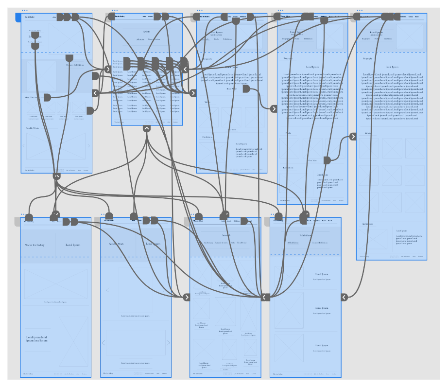
For my low-fidelity prototype I created a primary user flow and connected all the screens involved in finding an artist to learn about and the reading their bio. I also included pages in which the user might explore the website.
View https://xd.adobe.com/view/40c2ee33-55f7-4bb1-9f4e-2984e0fca2ec-1591/?fullscreen
Next Steps
Usability Study: Parameters & Findings
Mockups
To implement the feedback I received from the usability study, I changed the structure of the list of artists. To make reading the list easier I organized the names in a single column rather than five so users could scroll through the names without feeling overwhelmed by the quantity.
High-fidelity Prototype
My high-fidelity prototype follows the same flow as the lo-fi prototype but encompassed design changes as a result of the usability study. By including the feedback presented to me I was able to improve the websites usability and aesthetic appearance.
View https://xd.adobe.com/view/c246aea5-62ef-4a0d-9b2e-419f6590ba87-9715/?fullscreen
Accessibility Considerations
Impact
My target users shared that the design was well thought out and easy to navigate between pages, visually appealing, and demonstrated an organized collection of information.
My Solution
Design an art gallery website that is user-friendly and informative by providing effortless navigation and budding curiosity.
What I Learned
Throughout the project, I learned the importance of iterating on design and using feedback as a tool for inspiration. I found that in the process of designing it can be valuable to take a step back from your work to better understand the greater picture and then come back to working out the details with the user’s needs in focus.


